Description
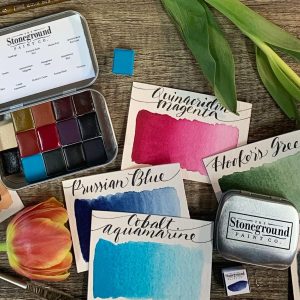
Stoneground Summer Palette
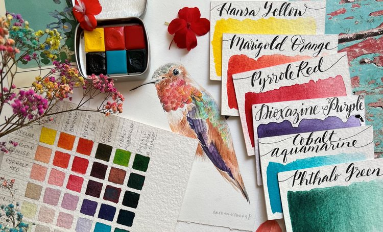
The Stoneground Summer palette is a wonderful choice for a collection of bright colours with a broad range of uses from abstract work, to landscapes, botanicals, wildlife, and more.
Artist Notes:
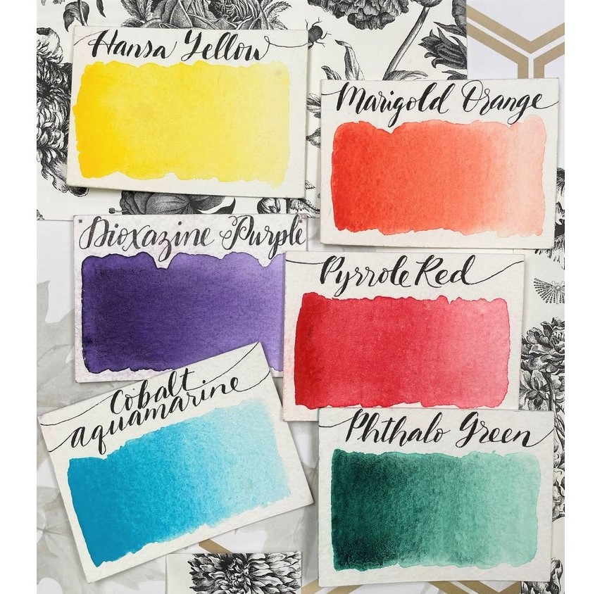
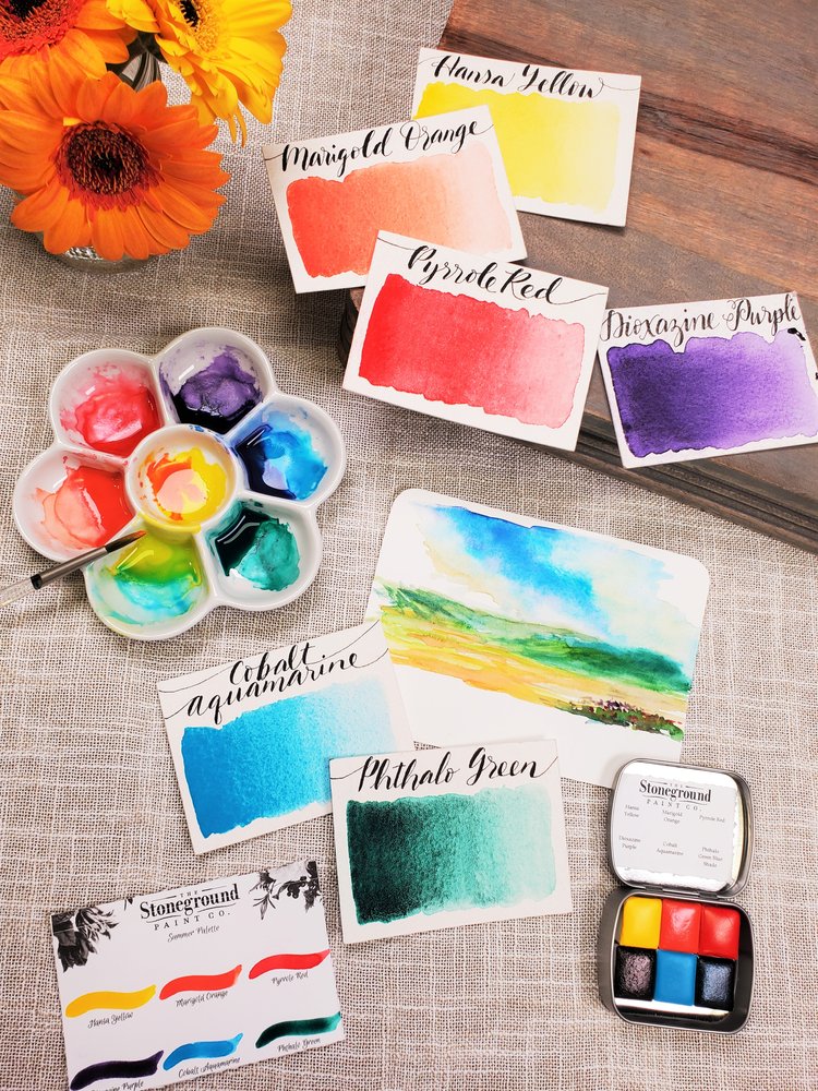
Combine Hansa Yellow and Phthalo Green Blue Shade to create vibrant tropical greens, or add Manganese Violet to Hansa Yellow in order to create warm brown tones perfect for late summer landscapes. Cobalt Aquamarine pairs beautifully with Phthalo Green and Hansa Yellow to create a range of cool colours from turquoise green through lime. Mix Marigold Orange with Hansa Yellow combine to create peach tones perfect for florals, or blend Manganese and Scarlet for dusty violets that are perfect for sunsets.
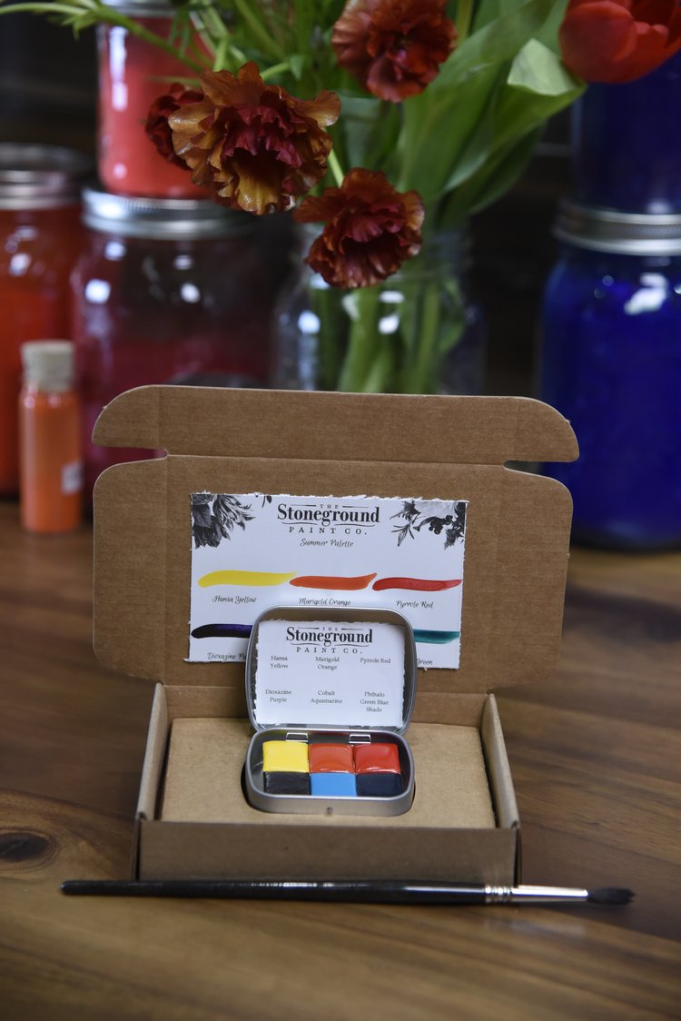
Stoneground’s Summer Palette Contains:
- Hansa Yellow (PY 74)
- Marigold Orange (PO 34)
- Pyrrole Red (PR 254)
- Manganese Violet (PV 16)
- Cobalt Aquamarine (PB 36)
- Phthalo Green Blue Shade (PG 7)
About the Colours:
A bright primary yellow, and a versatile all-around workhorse, Hansa Yellow mixes well with other watercolours, and is the perfect replacement for toxic Cadmium pigments. Hansa Yellow is one of our best-selling colours, working well in landscapes, botanicals, still life compositions, and illustration work.
A warm and intense orange, Marigold Orange is bold when used full strength, but don’t be fooled! Marigold has a beautiful coral undertone that is useful in creating rosy-blush tones when applied dilutely. Use this beautiful colour in landscapes and botanical works, and in portrait painting where light skin tones are needed.
An intense, bright primary red, Pyrrole Red is an excellent substitute for toxic Cadmium Reds. This powerful color is great for use in florals, landscapes, illustration, and lettering projects, and it mixes beautifully with other watercolours. Pyrrole and Carmine are both strong primary reds and appear similar, however Pyrrole is less intense when used full strength.
Significantly darker than Manganese Violet, Dioxazine Purple is a deep, rich violet-blue that is perfect for capturing everything from almost black shadows to pale lavender blossoms.
Cobalt Aquamarine is an intense turquoise blue-green pigment that is helpful when used to adjust the temperature of blues and greens. An excellent mixing complement, Cobalt Aquamarine is useful in landscape, seascape and botanical watercolours, and is beautiful when used full strength or in washes.
Phthalo Green Blue Shade is an intense, clear, bright greenish blue that has a jewel-like quality to it when applied. Phthalo Greens are noted for their high tinting strength and their intensity, however Phthalo Green Blue Shade is notably stronger than Phthalo Green Yellow Shade.

